Preview WIP: Bowzer, an intuitive web view for revisitation and recall
Overview
Bowzer is a web browser that fixes the tab browser window hierarchy problem. The problem with traditional browser tab-based navigation is the overabundance of tabs caused by parallel browsing patterns. Several existing web applications attempt to remedy this problem by adding more hierarchy or implementing tab search. However, none address the problem directly. Bowzer eliminates the hierarchical tab paradigm entirely with a graph-based browsing visualization. Each new page is visualized as a node added to the browse graph instead of a new tab. This node shows a preview of the page and various metadata. Navigation is simply done by selecting a node to be expanded.
The primary premise here is that human brains are particularly good at spatial memory. When you lose something it is very hard to simply remember its last seen location. However, if you mentally retrace your steps (ie your path) your spatial memory kicks in and helps. Research has shown that we excel at remembering paths and there are various memory enhancement techniques such as the memory palace—popularized by the BBC Sherlock Holmes series—that are built on this concept. We propose to extend that paradigm into web browsing with Bowzer.
Background
Too many tabs!
The current state-of-the-art tools for browsing the internet all use an organizational paradigm first pioneered in an application in 1988. As in the real-world equivalent, the amount of time it takes to find a specific tab varies directly with the number of open tabs and windows. Many symptomatic solutions exist; the most useful being plugins that allow users to search through their currently open tabs. Less related are tools that help clip and save pages for later recall such as Evernote and various bookmarking engines. Most users have developed some unique navigation strategy by either self-limiting and organizing their tabs and/or by using some combination of the aforementioned apps.
Bowzer eliminates the need for these organizational hacks by drawing inspiration from spatial memory mnemonic techniques for improving short-term memory (O'Keefe et al, 1978). Instead of showing a limited depth hierarchy (as in the case of browser windows and tabs) where there is very little spatial data, Bowzer shows the paths taken through the browse graph. This is done automatically without the need for any user interaction. The automatic aspect of this removes the constant monitoring that other tools require for clipping, bookmarking, or arranging tabs into loosely thematically structured windows.
Design
Design brainstorming session
The Bowzer design builds off of the hexagonal shape. During design testing, this shape was the most conducive to nesting and placing different sized nodes. The nodes can snap and the look and feel is intuitive. Metadata annotations can slide out of the sides and the path visualization was reported to be easy to follow in UX interviews with hexagons more so than other shapes.
Top Level View — A Forest of Browse Trees
We start with the forest view. This is the home “tab”. Here is where you can organize your browse trees (your sets of tabs). Some trees are automatic, showing web browsing done on a particular day; others are curated by the user. Some are groupings of trees by subject matter.
Forest view
Browse View
Next, we have a regular-looking browsing view. This is what we are all used to, how we browse a single page. Note we have a pullout tab on the left and some tools on the upper right. The left pullout will show us the current tree view. The first tool is the ➕ for adding the page as a node to the tree. Adding nodes can be set to either automatic mode where every page you visit is added to the search tree automatically or manual mode where the user would have to click the ➕ to add the current page. There is also a ✂ tool that allows us to prune the tree to delete nodes and branches off of it. This can be handy for deleting those perhaps all-too-often distractions that occur during web usage.
Basic page view
Tree View
When we slide out the tree view pullout we see the pages that have been visited laid out on a two-dimensional graph. In this example tree, we are researching hypoallergenic cats. We started the journey by googling “hypoallergenic cats” and have browsed through some pages to land on the current page about the Selkirk Rex — a curly-haired cat! Note how the nodes are lumped around the Wikipedia page on hypoallergenic cats. Nodes that share the same domain are directly adjacent, whereas nodes that are hyperlinked but on different domains are separated with a line. The tree view is the critical part of Bowzer and where most of the magic happens. This view is built on the understanding that remembering your search path will trigger your memory better than simply seeing a list of URLs.
Tree tray view
Search View
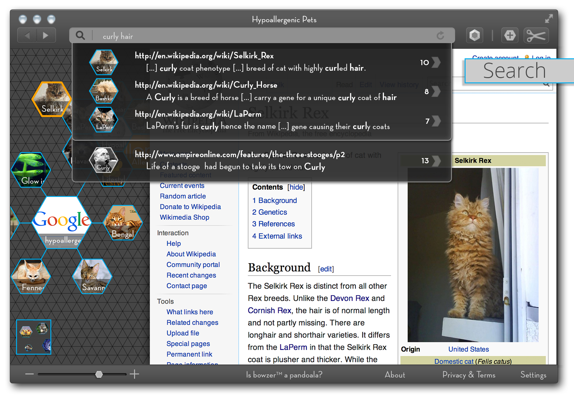
Any page node on the graph you have visited and saved onto your search tree becomes full text searchable. This allows you to search through your visited and annotated version of the internet. Most browser history search functionality searches titles and URLs at best. Bowzer remembers more data about each page you visited allowing for a more powerful search. This view needs some work — the current design iteration does not explore how to highlight tree nodes during the search. Since visualizing the path of how you got somewhere is the central concept this does need further iteration.
Search through history
Metadata
Each page node on the graph has some associated metadata: automatic data such as when it was visited but perhaps more importantly user-generated metadata; annotations and comments for when you are collaborating on a research browse tree together; popularity trends and page ranks for the URL generated by how many times it appears in various browse trees; and perhaps most importantly, trust ratings computed based on user-submitted content and source reputation scores.
See metadata on each page node
Notes and Comments — Shared Search Trees
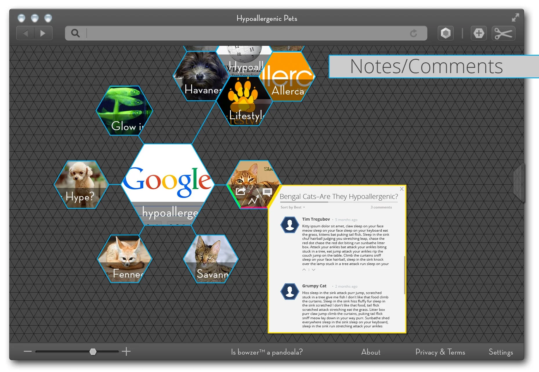
Part of the goal of Bowzer is to enable users to collaborate on search trees. In this example, two users discuss whether the Bengal Cat breed is, in fact, hypoallergenic or not. There are many use cases for shared search trees: finding a hypoallergenic cat breed might be one, but other common use cases might be planning a trip itinerary or actual research. Users are able to explore the shared tree, catch up on comments, and add new nodes. Trees can also be marked as public and shared with the world. If I spent time curating a beautiful tree of resources about hypoallergenic cats I might very well want to share that with the rest of the world.
Notes and comments on each page node
Recommendations Graft View
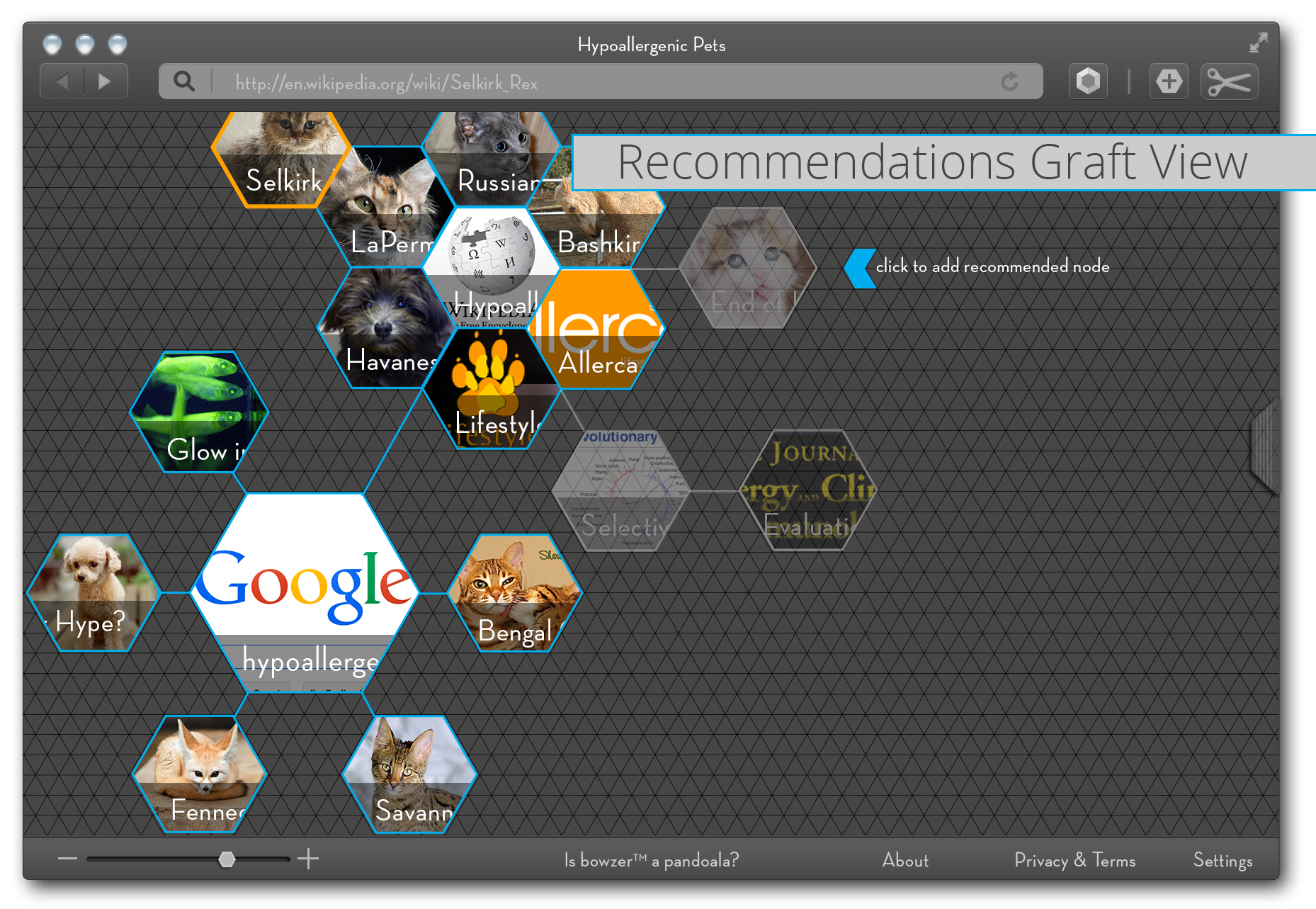
With some careful anonymization work and of course, user permission, Bowzer comes with a built-in powerful recommendation engine. This engine is based on public user-generated browse trees. In this example, a user sees recommendations of nodes to add to their research tree. These recommendations are based on other similar trees. Someone else was also researching hypoallergenic cats and saved pages that this user hadn’t yet visited. Bowzer can show you suggested search branches you can visit and graft onto your own search tree. These can be more powerful than usual search engine recommendations, as Bowzer will have the entire tree to compare — not just the current search terms as is common in search engines.
Recommendations grafts from friends/recommendation engine
Conclusion
Bowzer is the future of browsing. There is no need for us to hold onto the tabs and hierarchies of the past. As our technology usage evolves and our user interface design languages evolve, we are able to embrace new and more advanced interface paradigms. We no longer need skeuomorphic design in which digital interfaces mirror physical ones. By extension, we can operate in more dimensions than the one-dimensional world in which the linear tab browser model traps us.
Join me in building this next iteration of web browser interfaces!


